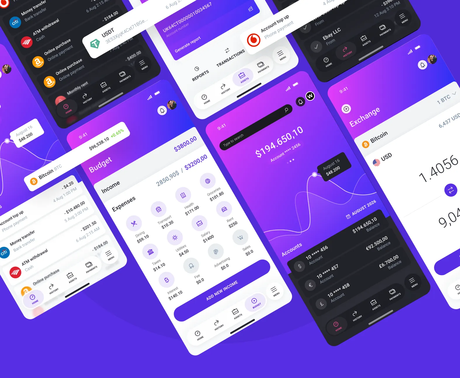
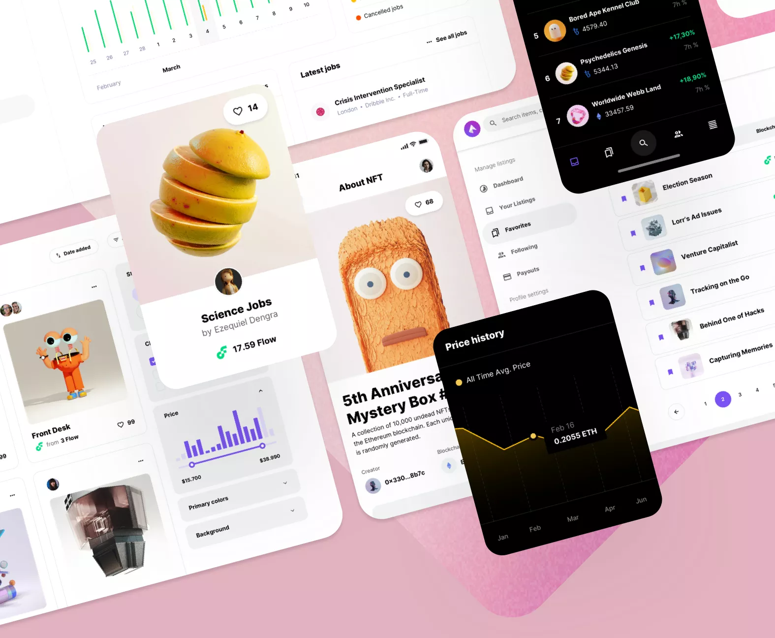
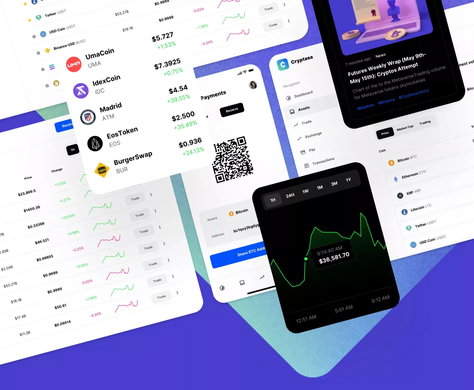
Designing stunning and highly functional applications has become significantly more accessible, primarily due to the vast ecosystem of UI resources available for Sketch App. For both seasoned designers and proactive developers, integrating these resources is absolutely essential for maximizing efficiency, streamlining workflows, and ensuring the delivery of high-quality, polished interfaces. By strategically utilizing pre-designed components, you dramatically reduce the need to construct every single element from the ground up, allowing you to save invaluable time and channel your focus directly onto the core tenets of the user experience and innovation. We specialize in providing meticulously crafted, high-quality Sketch app resources with an unwavering commitment to detail and design excellence.
A foundational element in this ecosystem is the UI kit for Sketch App. This is not merely a random assortment, but a well-organized collection of user interface components, including essential elements like buttons, icons, input forms, and an established typography standard, all carefully designed to work together seamlessly. Often built upon established and popular design systems, these kits represent a massive time-saving investment. Employing a professionally structured UI kit is the most effective way to guarantee visual and functional consistency throughout your entire design, which is a non-negotiable principle for achieving an excellent user experience. Regardless of your project's scope, whether you're architecting a complex fintech dashboard or a feature-rich social media platform, a specialized UI kit for Sketch App is readily available to align perfectly with your project's unique requirements.
For those moments when a project needs to be jump-started immediately, mobile app templates offer the perfect solution. These are comprehensive, multi-screen application designs that serve as an incredibly solid, ready-to-use foundation. They are the ideal choice for rapidly prototyping a new concept to test market viability or for the freelance designer who needs to present a professional, client-ready design in record time. With templates spanning a wide range of application categories, from complex e-commerce platforms and intuitive food delivery services to engaging fitness trackers and secure banking interfaces, you are virtually guaranteed to find a ready-made solution that provides a significant head start. The extensive library of mobile app templates available for Sketch App includes sophisticated designs optimized for iOS, Android, and even specific device dimensions and modern design paradigms.
The true power of these resources lies in their ability to facilitate rapid, scalable iteration and maintenance. Beyond simple time-saving, leveraging an atomic design approach through these component libraries transforms the design process from a series of one-off creations into a systematic, reusable methodology. When a change is required, such as a brand color update or an adjustment to button padding, modifying a single component in the library propagates that change across the entire application instantly, preventing costly inconsistencies and manual corrections. This systematic approach, deeply embedded in high-quality Sketch resources, is critical for large teams and long-term projects where design debt can quickly accumulate. Furthermore, a well-documented resource bridges the gap between design and development by providing developers with clear specifications, standardized code-ready elements, and fewer subjective design decisions to interpret. This synergy ensures that the final product remains pixel-perfect to the original vision, vastly improving the transition from design mockups to a live, coded application and cementing the resource's role as an indispensable tool for modern product development.