Upon the release of any new version, you will be promptly notified via email. All forthcoming updates are provided free of charge, ensuring your design system remains current and continually enhanced. These updates consistently introduce valuable new features, maintain compatibility with the latest application versions (including Figma, Sketch, and Framer), and integrate performance improvements.
For comprehensive details regarding our licensing rules, permitted usage, and any restrictions, kindly consult the dedicated license page. Should you require an upgrade to a previously acquired license, please reach out to our support team to receive a unique upgrade code. This ensures a seamless and compliant transition to the enhanced usage tier your project requires.
For detailed information about the refund policy, please visit the refund page. Given the digital nature of our products, all sales are final. Refunds are exclusively granted under a few limited conditions.
A UI Kit (User Interface Kit) is a comprehensive set of pre-designed, reusable components and resources that help designers and developers create consistent and efficient user interfaces for websites, applications, and other digital products. Think of it as a toolkit that standardizes the building blocks of an interface, accelerating the design process and ensuring a cohesive look and feel across all screens.
The resources in a UI kit typically encompass elements necessary for crafting a complete interface. These include:
- UI Components: Buttons, forms, navigation bars, sliders, checkboxes, and other interactive elements.
- Style Guides: Defined colors, typography, iconography, and spacing rules.
-Templates & Layouts: Pre-built screen designs or common page structures.
Crucially, a UI kit usually includes only design resources that are native to popular design applications like Sketch and Figma. These are vector-based files that designers can easily modify and scale. They generally do not include the actual front-end code (like HTML, CSS, or JavaScript) for developers; they serve as the visual blueprint for development.
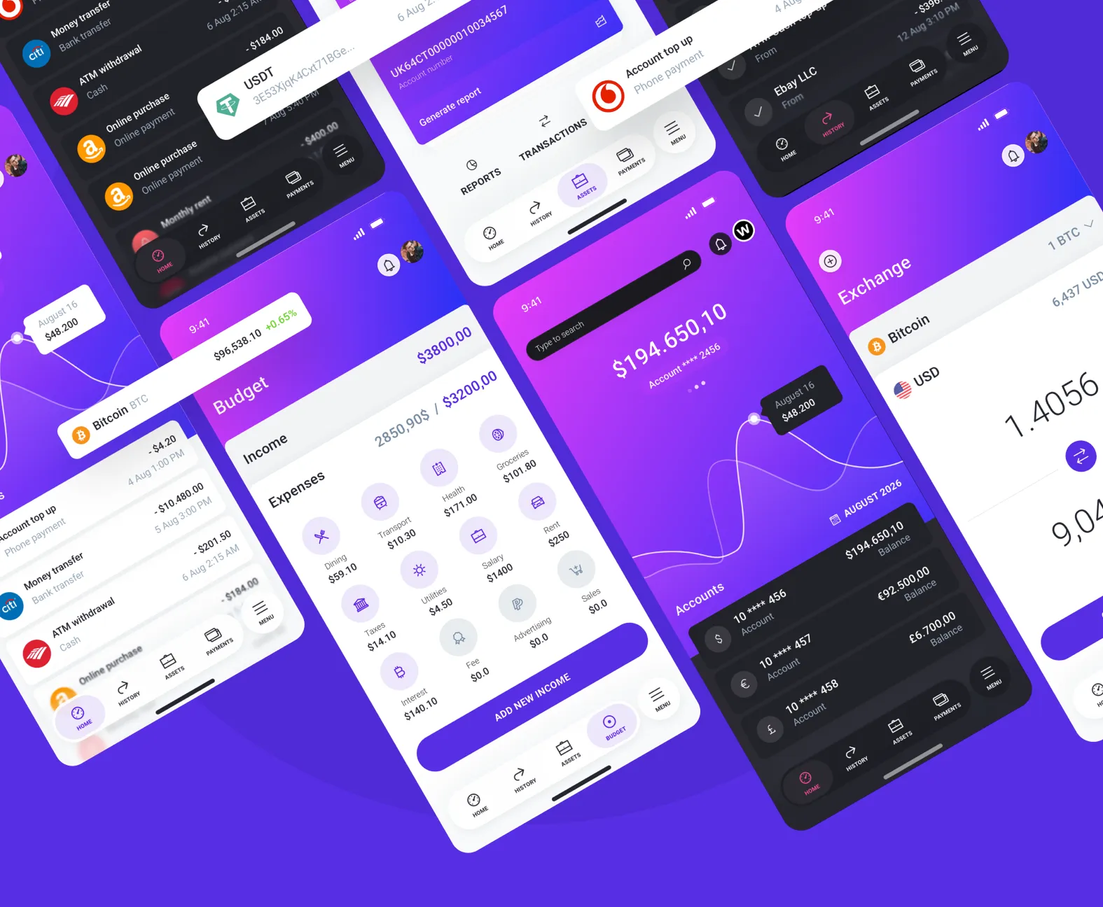
The world of FinTech demands precision, clarity, and trust. If you are developing a banking application, budgeting tool, investment platform, or any service dealing with sensitive user money, you need a design system that instills confidence and simplifies complex data. A premium Finance UI Kit is the crucial tool that empowers you to design and deploy sophisticated financial applications efficiently and effectively. This specialized resource is built around the unique challenges and user needs of the financial sector.
A generic design system won't cut it when dealing with money. A purpose-built Finance UI Kit includes components specifically designed for financial interactions, ensuring you cover every crucial use case from secure onboarding to complex reporting. It provides a massive head start, allowing you to focus on innovation and compliance rather than fundamental design.
Financial apps live and die by their ability to clearly present data. The kit provides a diverse range of elegant charts, graphs, and summary widgets for tracking spending, monitoring portfolio performance, and visualizing trends, making complex information instantly understandable to the user.
Save hundreds of hours with pre-designed screens for essential functions like account summaries, transaction history, payment/transfer flows, budgeting tools, and dedicated screens for managing credit cards or loans. These are built following modern FinTech UX standards.
Invest in a professional Finance UI Kit to guarantee your application is not only beautiful but also intuitive, secure, and ready to scale. Give your users the clear, trustworthy financial experience they deserve.