Designers and developers seeking to accelerate their workflows and produce highly polished interfaces consistently rely on the vast ecosystem of UI resources available for Figma. This immensely powerful, collaborative design tool is supported by an unparalleled community that provides virtually everything necessary to construct stunning digital products efficiently, eliminating the need to build foundational elements from scratch. By judiciously utilizing pre-built components, design systems, and specialized templates, you can achieve significant time savings and effortlessly guarantee a consistent, professional aesthetic across the entirety of your design portfolio.
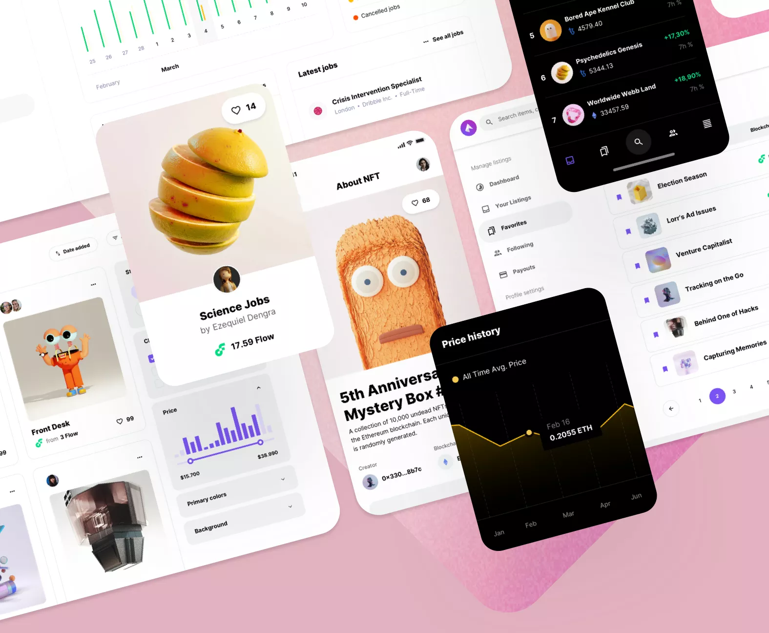
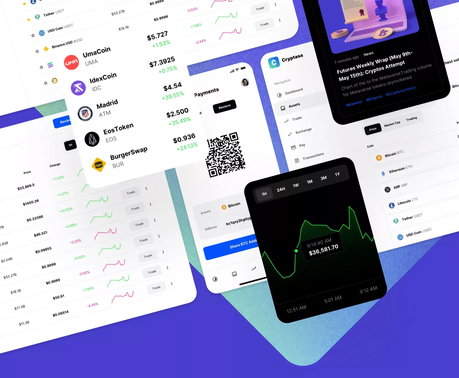
A meticulously organized UI kit for Figma is truly a game-changer for any design project. These kits function as a comprehensive, dynamic library of user interface elements, encompassing everything from interactive buttons and complex navigation menus to specialized form fields, all engineered to operate together harmoniously. Crucially, they are often built to adhere to established or custom design systems, which is the cornerstone for ensuring brand consistency and a flawless, cohesive user experience. Regardless of whether you are constructing a large-scale enterprise web application or a sleek mobile product, a high-quality UI kit for Figma furnishes the essential building blocks, freeing you to concentrate on the high-level aspects: overall layout, complex user flows, and core functionality, rather than getting bogged down in the minute details of individual element styling.
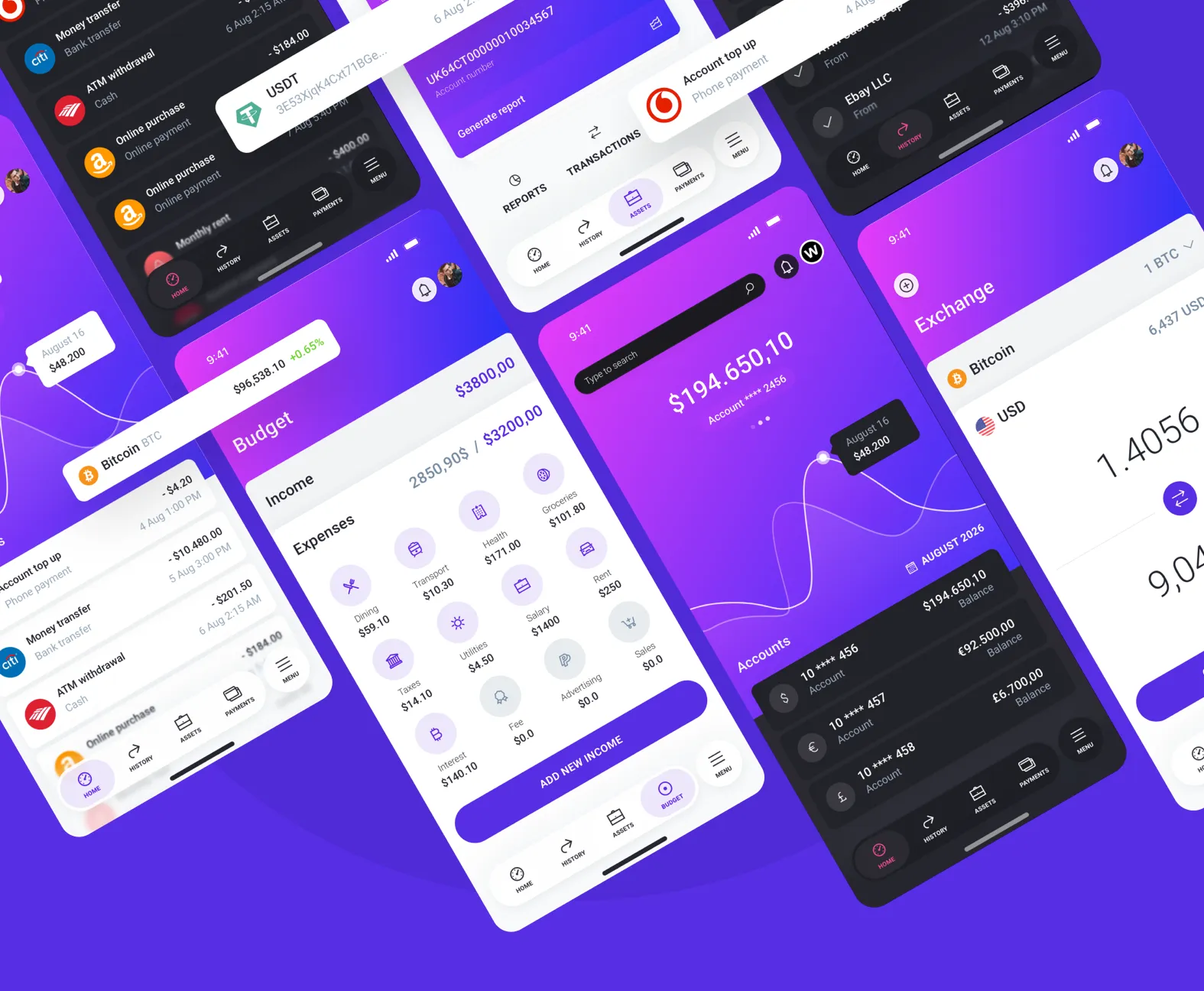
When the objective is to aggressively jumpstart a new project, mobile app templates are the most effective solution. These templates are not mere component collections; they represent complete, multi-screen application designs that provide an immediate and robust foundation. They are perfectly suited for rapidly prototyping and validating an idea or enabling a freelance professional to deliver a high-fidelity, professional-grade design in record time. With comprehensive templates accessible for a diverse range of app types, spanning sophisticated e-commerce platforms, streamlined food delivery services, personalized fitness trackers, and secure banking interfaces, you can easily pinpoint a ready-made solution that guarantees a significant head start. The extensive library of mobile app templates ensures you can find polished designs optimized for modern standards on iOS, Android, and specific device types.
Figma's dominance in the resource ecosystem is reinforced by its inherent collaborative capabilities and sophisticated component management system, features that go far beyond simple asset provision. Unlike traditional file-based design, Figma allows designers, developers, and product managers to work within the same live file, instantly seeing updates and providing feedback, which drastically minimizes miscommunication and accelerates the feedback loop. This real-time collaboration is particularly powerful when coupled with Figma's Component properties and Variants, which allow designers to create highly flexible, single-source components that can be customized dramatically without detaching from the master. This systematic approach is essential for scalability. It ensures that any update to the master component, like a design system color change, is automatically reflected across hundreds of instances in a project. This level of control and speed is paramount for maintaining large, evolving applications and solidifies why Figma resources are the industry standard for agile, enterprise-level product development.