


About the product
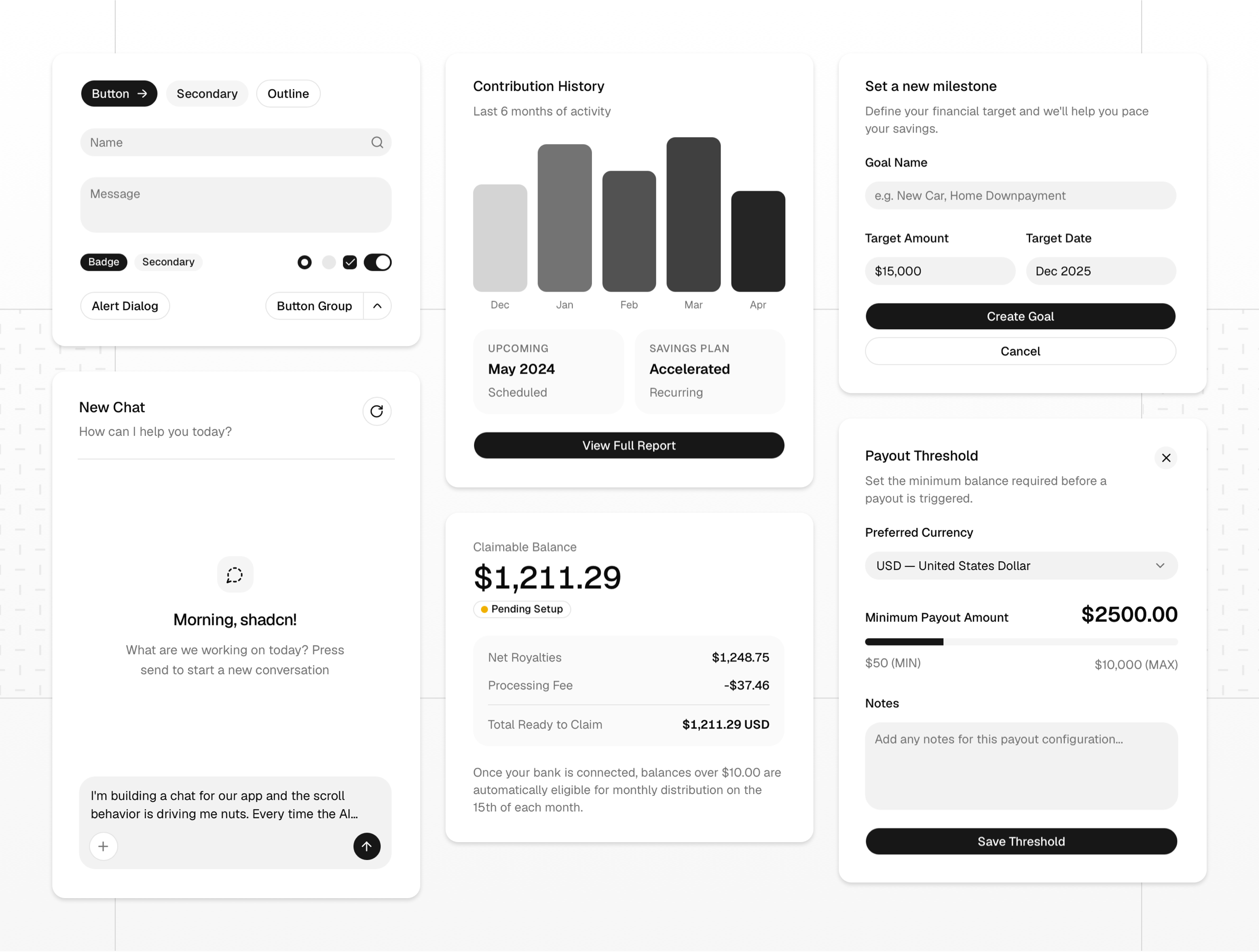
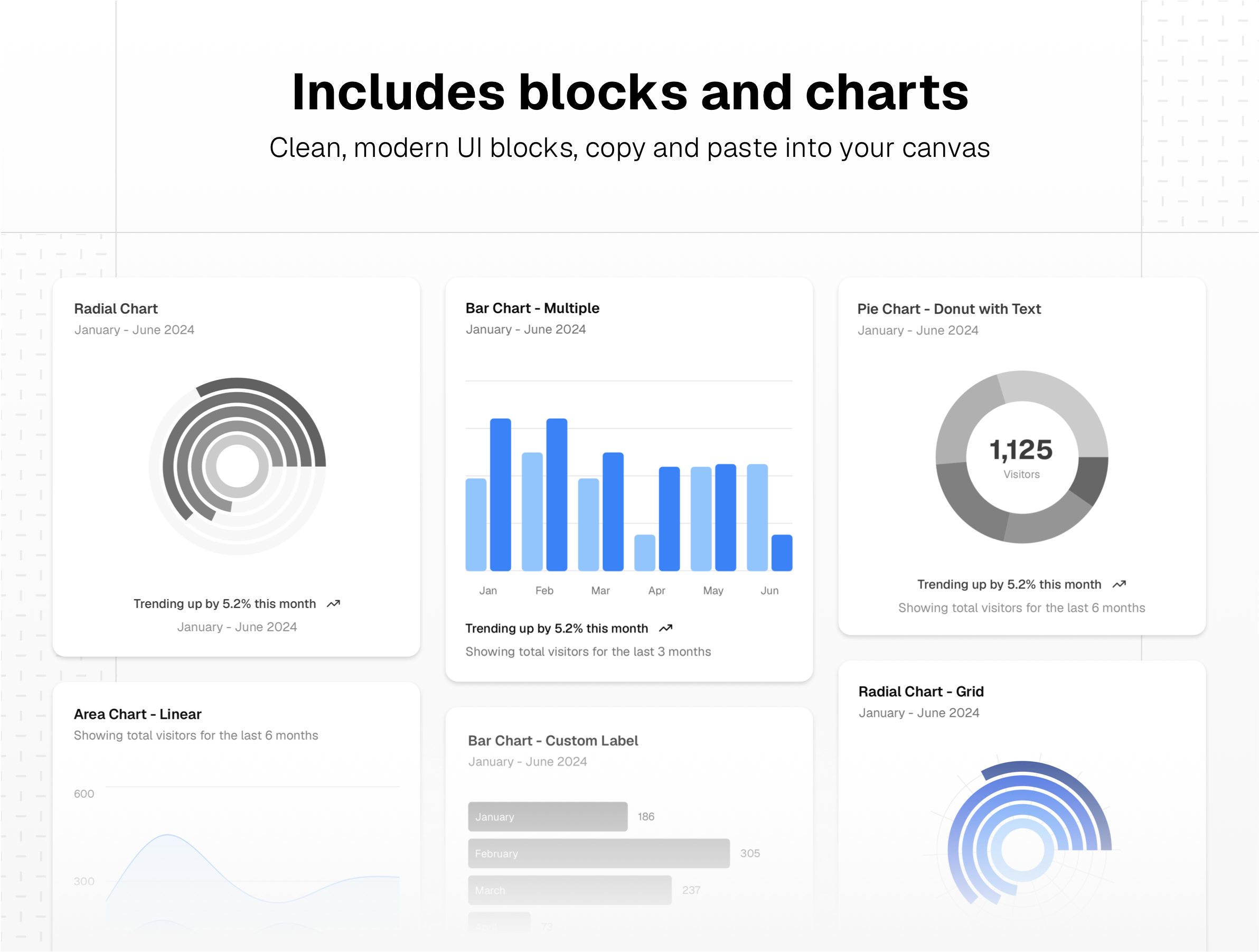
The Shadcn /ui components kit for Sketch is a premium, meticulously crafted UI kit designed to bring the highly popular, developer-loved shadcn/ui framework directly into your native Sketch workspace. We didn't just import static graphics; we rebuilt every single component from the ground up to take full advantage of Sketch’s most powerful and modern capabilities. Stop wasting hours pushing pixels and rebuilding basic UI elements from scratch. Whether you are prototyping a rapid MVP, designing a complex enterprise dashboard, or establishing a scalable design system, this kit provides a clean, accessible, and highly organized foundation. It fundamentally bridges the gap between design and frontend development, allowing you to focus on user experience rather than component maintenance.
- Manage components with Sketch Stack Layout: Say goodbye to manual resizing and tedious alignment tasks. Every component in this kit leverages Sketch's Smart Layout and Stack features. Buttons, complex dropdowns, form fields, and data cards adapt instantly and elegantly as you type new content, override text, or hide nested UI elements.
- Design system with tokens & color variables: Keep your entire visual system perfectly in sync. We have mapped the foundational shadcn/ui design tokens directly to Sketch Color Variables. Need to change your primary brand color? Adjust a single variable and watch the global theme update instantaneously and flawlessly across your entire document.
- Includes linked shared layer styles: Consistency across your files is non-negotiable. From typography scales to subtle state shadows and border radius, every visual detail is strictly connected to Shared Layer Styles and Text Styles. Change a core style once, and the update ripples throughout your entire project.
- Created with thoughts about seamless developer handoff: Because this kit rigorously mirrors the exact architecture, variants, and naming conventions of the actual shadcn/ui React components, your engineering team will know exactly what they are looking at. Built with the logic of Tailwind CSS utility structures in mind, this kit eliminates the friction and translation errors typically found during the handoff from design to code.
This is not just another UI kit; it is a serious workflow upgrade for product designers who value precision, consistency, and speed. Grab the Shadcn /ui components kit for Sketch today and start shipping better interfaces, faster.
Disclaimer: This Shadcn /UI Components kit is designed exclusively for Sketch for Mac. After purchase, you will receive only a Sketch app file. Other additional resources are not available in this product, e.g., Figma files, coded components, custom blocks, React code, etc. We're not affiliated with the developers of the React framework, and the authorship of the original design systems belongs to Shadcn.
Key features
67 Pages
5 Categories
200+ UI Components
Google Fonts
Design System
Light and Dark UI theme
Material Symbols & Icons
Framer components
Vector-based components
Content backed by Framer CMS
Styles & Color Variables
Well-organized design files
Figma Auto Layout
Sketch Stack Layout
Changelog
Questions we get asked the most
Designed by