Stacks, a new Sketch feature, will change how you design. From simple buttons to complex user interfaces, they provide a flexible and adaptable way to create layouts.
With the Athens release of the Sketch app, Stacks - a highly-requested feature for creating flexible UI elements was introduced. Stacks allow you to build components that automatically grow, shrink, and adjust their content and spacing based on context. You can even nest stacks within other stacks to create powerful, dynamic layouts. If you're familiar with similar features like Figma's Auto Layout or Framer's Stacks, this is our version.
From Smart Layout to Stacks
Stacks have been a long time coming. Why did we build them now? And what do they offer designers? I'll answer those questions in this post. We’ll cover how we built them in a future article, but for now, let's start with the problem Stacks solve.
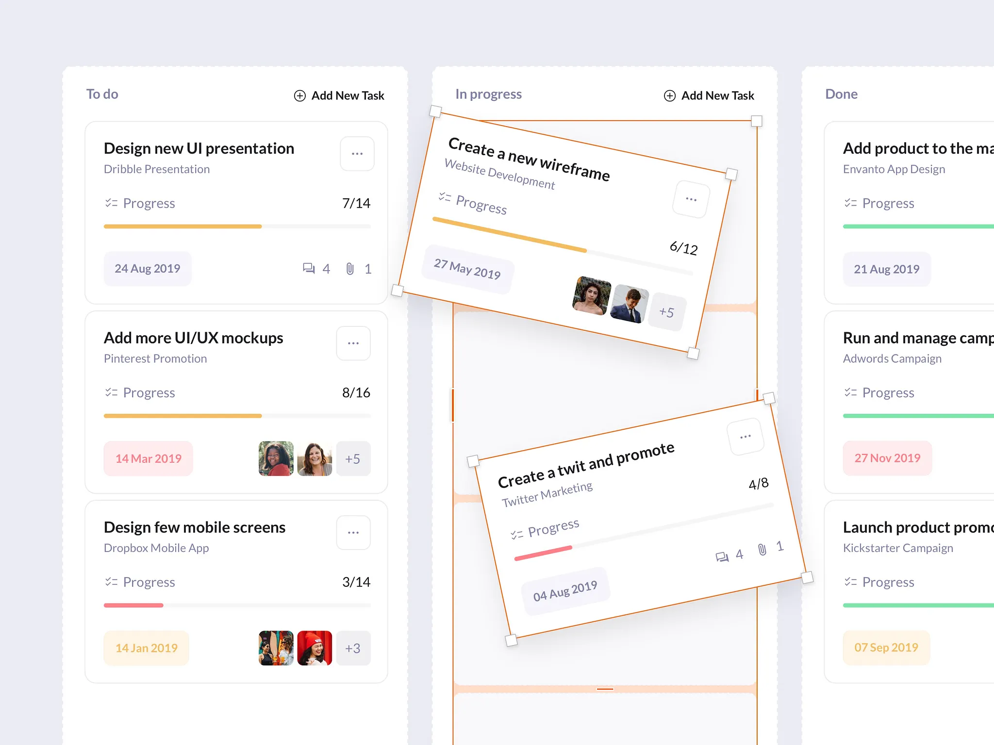
Have you ever adjusted the size of a UI element, only to have to manually move everything else around to fix the spacing? This repetitive task is a huge time-waster, especially when you're making countless design iterations. Stacks eliminate this tedious work.
Designers need their tools to work with them, not against them. Our primary focus when developing Smart Layout was simplicity. With this feature, layers within a group would maintain their exact positions, only adapting if you resized, added, or removed layers.
Seeing how well tools like Swift's Stacks and CSS's Flexbox worked, our users requested more advanced layout features in Sketch. The development team had taken Smart Layout as far as it could go, so we began building something new.
This new feature became Stacks, which required a new container type in Sketch called Frames. Frames are a crucial part of how Stacks work. Unlike groups or Artboards, Frames are more flexible; they can have a fixed size or dynamically fit their content. For more information, check out our other blog post on Frames.
Designing with Stacks
So, how do you use Stacks, and what are the best practices?
There's no single "right" way to use Stacks. You can create a Stack with no content and build within it, or you can create one from layers you've already designed. When you create a Stack from existing content, Sketch automatically applies the most relevant layout properties based on how your layers are arranged.
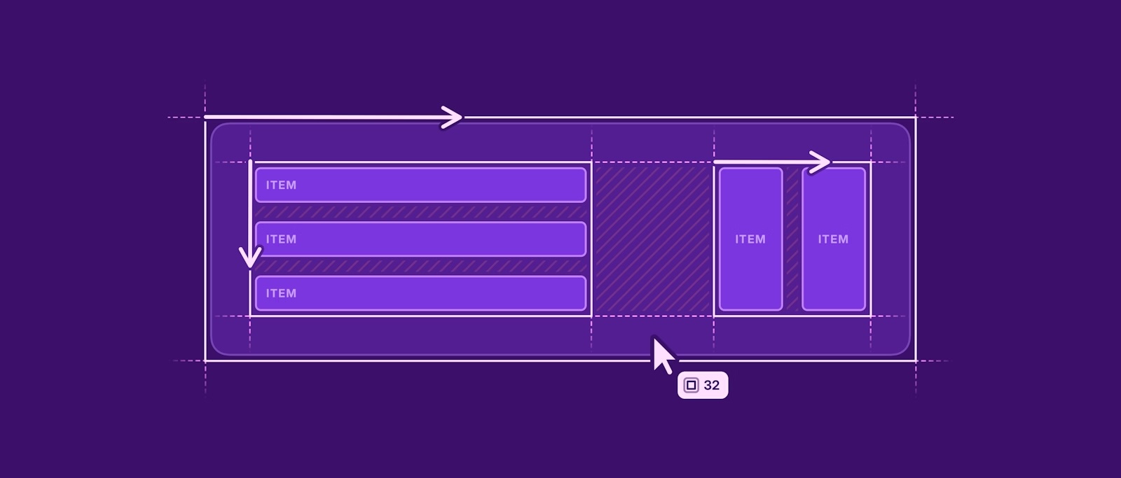
A great example of a Stack is a button that resizes with its text. To create one, draw a rectangle and add a text layer on top. Then, select both and press ⌘L. Sketch will automatically apply the most logical layout settings, and you'll notice the rectangle has disappeared, with its styling now applied to the Stack itself.
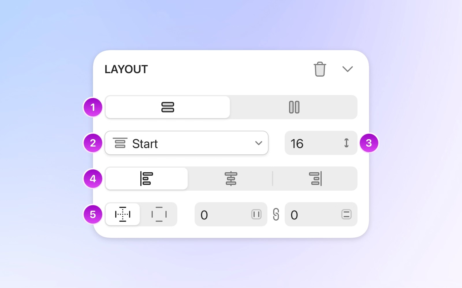
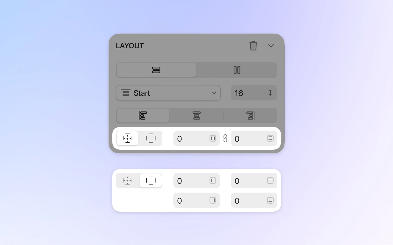
Once you've created your button, you can adjust the padding and alignment in the Inspector, or click and drag directly on the Canvas to set the padding visually. If you drag an icon into the button, it will automatically become part of the stack, and everything will adjust dynamically. This is because the stack's width is set to fit its contents (the total of the layer, gap, and padding values).
Items within a stack flow either horizontally or vertically—you can't freely position layers like you can elsewhere in Sketch. While a single stack can't have both horizontal and vertical layouts, you can easily nest a vertical stack inside a horizontal one (or vice versa).
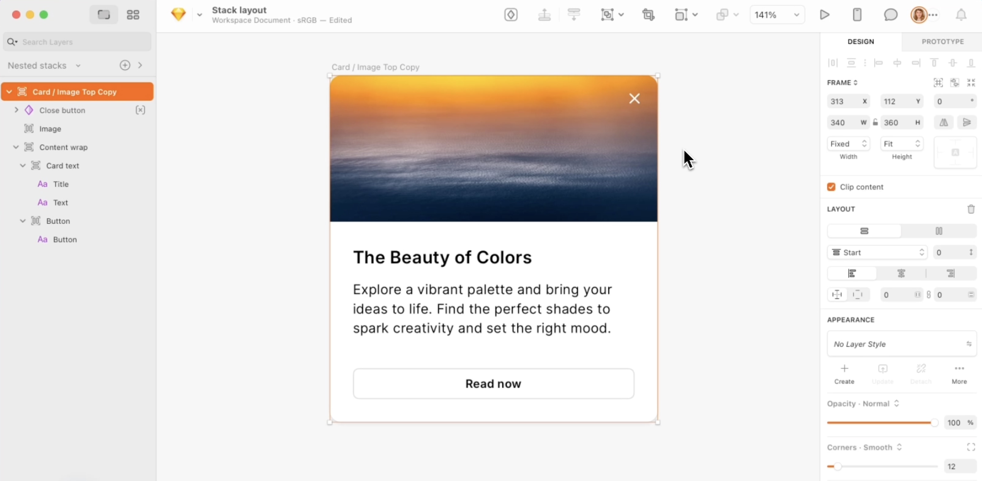
For example, this modal dialog uses a combination of nested horizontal and vertical stacks. The main vertical stack's height will automatically adjust to fit the length of the text inside it, creating a dynamic and responsive component.
Here's how this stack is built:
- The title and description are in a vertical stack.
- The checkbox and its label are in a horizontal stack.
- The two buttons are also in a horizontal stack, and they are themselves horizontal stacks.
- All of these elements are nested inside a main vertical stack that is center-aligned and has consistent padding applied around its contents.
You might be wondering about the close button in the top-right corner. It's also inside the main stack, but its "Ignore stack layout" property is enabled in the Inspector. This allows you to position it freely without affecting the other layers. You can also override the alignment of individual layers within a stack, giving you the flexibility to make exceptions when needed.
A better way to design with Stacks
Using stacks will make you a better designer. If you're new to the concept, it may take some time to fully grasp, and that's completely normal. However, there will be a moment when it just "clicks," and it will fundamentally change the way you approach your designs. Stacks make you more deliberate about spacing and alignment, which reduces inconsistencies that can happen with freeform design. This feature also saves you time, allowing you to iterate faster, explore different layouts, and create designs that are easier to update in the future.
Beyond saving you time, stacks will change how you think about layout, bringing your designs closer to how they're implemented. This makes handoff with developers much smoother. We’ve also reflected stacks in our web app's handoff tools, so developers can easily see all the layout information they need.
Sketch UI design resources that supports Stacks
We consistently update our UI kits, mobile app templates, web app templates, and other Sketch resources to ensure they're compatible with the latest features. Following the Stacks release, our most popular UI kits were updated with flexible, adaptable layouts. We'll continue to update this list as more of our resources are enabled with Stack support. Explore our collection of UI design resources for Sketch that have been updated to support Stacks.
1. BetaCRM UI kit for Sketch
We're excited to announce that our latest update brings Stacks support to the BetaCRM UI kit. This new version introduces an optimized design system where every component and group has been updated with the Stacks layout feature for Sketch.
Stacks give you precise control over how your designs adapt to content and available space. This powerful feature allows you to effortlessly create anything from buttons that resize automatically to reusable, multi-sized interfaces.
Learn more about BetaCRM UI Kit for Sketch

2. IOTask Web and Mobile UI kits for Sketch
We're excited to announce that our latest update brings Stacks support to the IOTask UI kit. In this version, you will find a rearranged Sketch file with full Stack feature support and an optimized design system with symbol variants in Figma.
Learn more about IOTask UI Kit for Sketch


